
EcoCAR Systems –
Designing a Cohesive Visual System
Overview
EcoCAR is a multidisciplinary engineering project that needed a cohesive visual system capable of scaling across digital and event-based touchpoints. I designed a system that balances UC Davis brand requirements, its real-world production constraints, and promotes clarity across a variety of use cases. My goal was to create a consistent visual system that could be easily applied and maintained by the multiple teams in the program.

Constraints
First, the design system needed to operate within several constraints, including the pre-defined university branding, the sponsor visibility requirements, and tight deadlines given by the team. Also, the assets needed to be legible at multiple scales and from varying viewing distances.
My primary goals were to ensure there was consistency across all materials and maintain clarity in high-visibility environments. Ultimately, to create a system that could be efficiently handed off and reused without constant redesign.

Core Visual System
This core visual system set up the foundation for layout, color usage, hierarchy, and composition. It was designed to support flexibility across many different formats while keeping a unified identity. These decisions prioritized legibility, adaptability, and ease of application across both large-scale and small-scale assets.

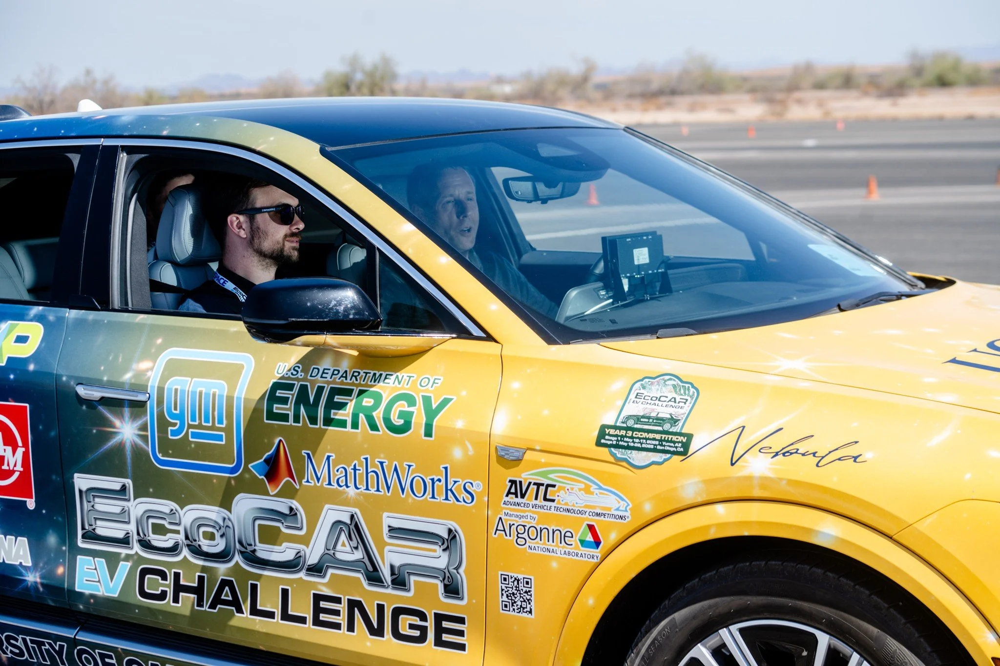
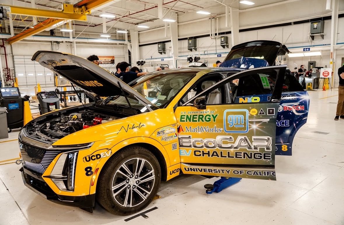
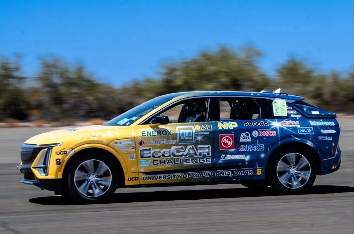
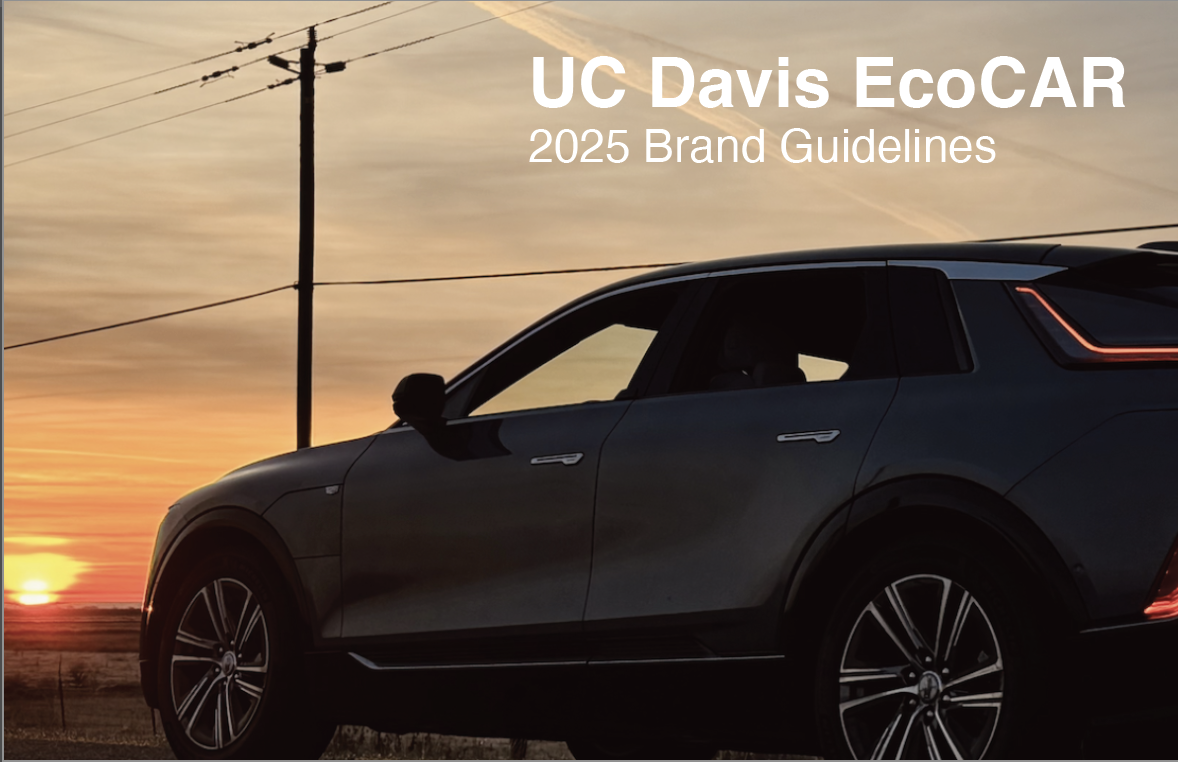
Vehicle Wrap
The vehicle wrap was the most complex, high-stakes application of the visual system. As the public face of the UC Davis EcoCAR team, the car served as the primary brand touchpoint at competitions, sponsor showcases, and national events, so every layout decision had to balance visual hierarchy, sponsor prominence, university identity, and legibility across an irregular surface and multiple viewing distances.
I chose the yellow and blue gradient to reference UC Davis colors while integrating a subtle space-inspired theme, both as a nod to its name, “Nebula,” and to reinforce innovation and forward thinking. The design was developed through scale-accurate mockups and production-ready files to ensure there was precise implementation across all segmented panels and curved surfaces. The final result highlighted sponsor visibility, strengthened team credibility, and was widely praised by stakeholders and collaborators.
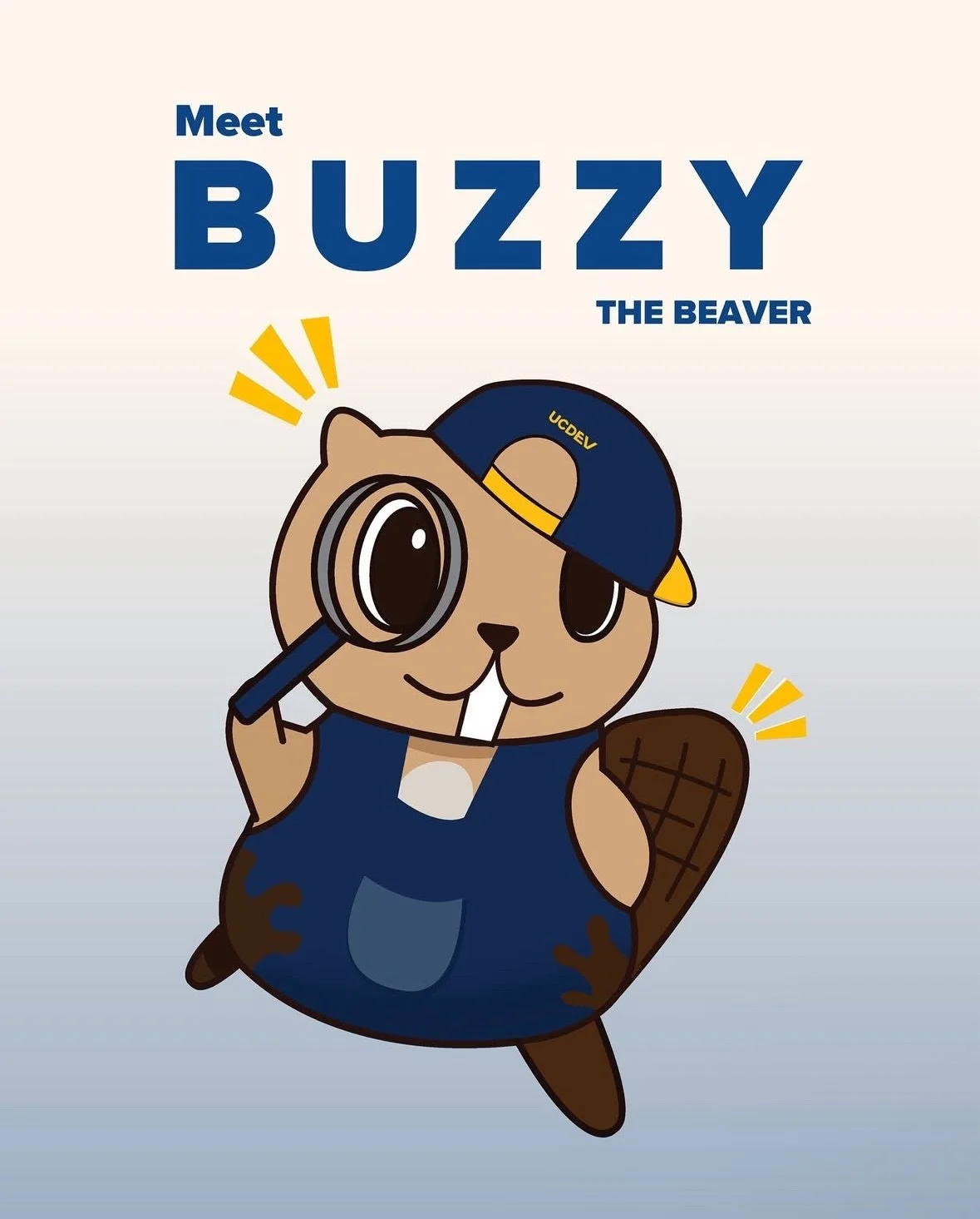
Stickers and Mascot
As part of this system, I also designed Buzzy, the official team mascot, to support EcoCAR’s outreach and educational efforts, particularly in its kid-focused and public-facing events. The mascot was intentionally created to feel friendly and inviting while staying aligned with established brand colors, typography, and visual constraints. As the team was composed mainly of engineers working on an eco-friendly project, it seemed naturally fitting that the mascot was one that reflected the same ideals, environmentally friendly, and builder. It was decided then that the mascot would be a beaver. By treating Buzzy as a system asset rather than a standalone illustration, the mascot could be applied consistently across stickers, printed materials, and digital use without breaking its visual cohesion.
Next, I worked on stickers to extend the visual system into small, high-frequency touchpoints, where it was clear that clarity and approachability were essential. Each of these designs followed the same core visual rules as larger assets, maintaining brand recognition while also adapting it to limited space and many different outreach contexts.
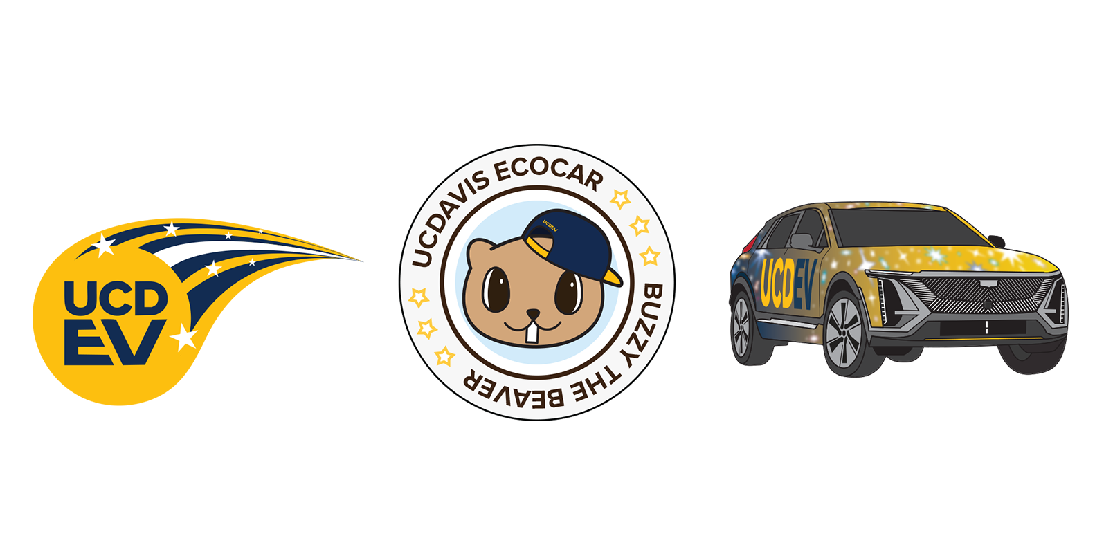
Sticker Designs:
Comet-inspired mark to represent the brand’s motion, energy, space theme, and forward momentum.
Buzzy the Beaver is a friendly mascot designed to make the brand approachable for younger audiences.
A stylized, space-inspired illustration of the Nebula vehicle for digital and promotional use.
Guidelines and Handoff
To support long-term use and scalability, I created clear guidelines outlining system rules, usage examples, and dos and don’ts. These materials enabled internal teams and external vendors to apply the system consistently without requiring ongoing design intervention.

Outcomes and Learnings
Lastly, the final visual system improved consistency across EcoCAR’s physical, digital, and event-based touchpoints, which greatly reduced any friction during production and handoff. By establishing such clear rules and reusable components, the program can now create faster asset creation while also maintaining clarity and brand alignment across multiple teams.
For me, this project also reinforced the importance of designing within real-world constraints, including university branding requirements, sponsor visibility expectations, and production limitations. It also strengthened my ability to work in a professional environment through formal approval processes, weekly cross-functional meetings, and iterative feedback cycles with faculty advisors and team leadership. Navigating critique, revisions, and occasional rejected concepts required me to be adaptable and resilient, reinforcing in me that strong design is shaped through collaboration and refinement.