Tiny Academy
Designing Accessible Learning Experiences
The Situation

A student is falling behind in math. Their family cannot afford expensive tutoring, and they do not know which free resources are actually reliable. When they look for help online, they are met with endless links, paywalls, and platforms that assume they already know what to look for.
The Core Problem
To start, I reviewed many tutoring and learning platforms, websites, and apps to understand how they structure discovery and onboarding. Some common patterns I encountered were:
• Immediate paywalls or subscription prompts
• Dense course marketplaces with little personalization
• Search first for content that assumes users know what to type
• Early account creation before showing resource value
• Overloaded dashboards with multiple feature tabs
While some of these platforms offer high-quality content, the first experience often prioritizes range over clarity to the user. This insight ultimately shaped my decision to focus on guided onboarding and public disclosure rather than open-ended browsing.
Students who need academic support usually face two barriers: cost and clarity. While there are plenty of tutoring platforms and learning apps, they very often require paid subscriptions, bring up an overwhelming number of course options, or push account creation before they offer any meaningful guidance.
For a student who needs help with any academic concept, this experience can feel more complicated than helpful.
Competitive Review

Constraints and Goals

Throughout this project, I focused on organizing fragmented information into a clear, usable product that supports informed decision-making for learners who have limited time, money, or guidance. The goal was to design an experience that felt both trustworthy and accessible across different learning needs and subjects.
First Iteration Sketches
These early sketches were used to map core user flows before moving into high-fidelity designs. My focus was on defining entry points and showing clear end states rather than visual detail. I prioritized two key actions a user needs to achieve their goal: finding the most helpful video and the right tutor for their needs.
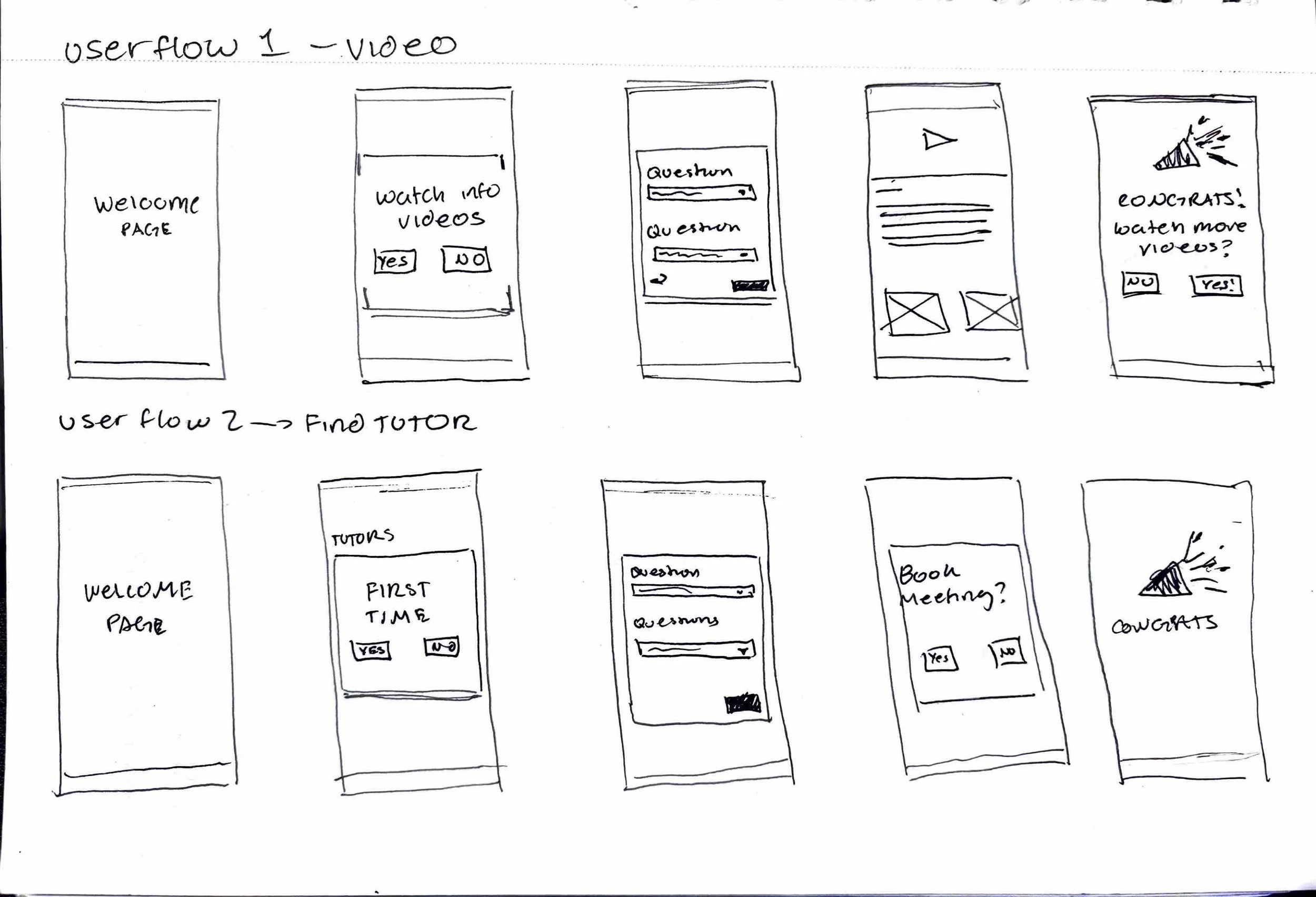
Early sketches mapping out user flows for watching videos and booking tutors.
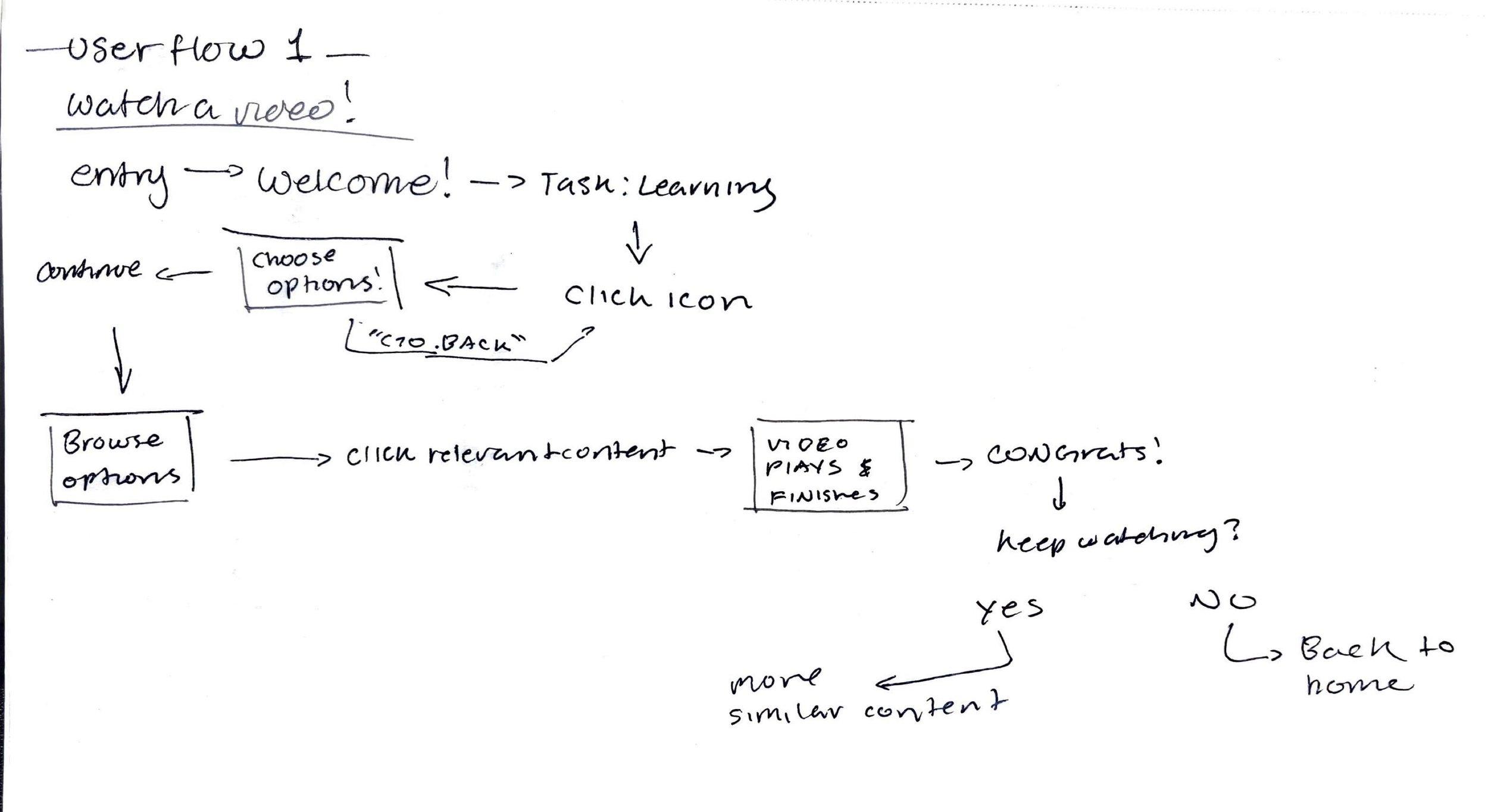
Flowchart for the video experience, showing user decisions and navigation logic.
By sketching both the video learning flow and the tutor discovery flow side by side, I was able to identify any shared patterns, simplify branching, and reduce all unnecessary steps. This process helped secure the overall structure early and ensured that the final high-fidelity designs prioritized clarity and ease of navigation.
Visual and Interaction Design
The visuals and structure were crucial to the effectiveness of our app. I spent the most time researching what color palette would both make users feel safe, yet also provide a sense of innovation. After multiple rounds of user feedback, the visual system we chose was designed to feel approachable, structured, and trustworthy without overwhelming students already navigating academic stress.
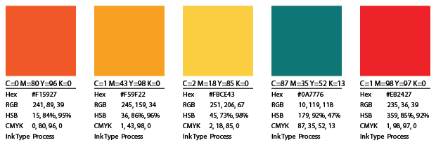
The primarily teal palette was chosen to balance trust and growth to the user; this stability is often associated with blue and the learning symbolism of green. Warm accent tones were introduced selectively to highlight recommendations and guide key actions without disrupting hierarchy. During critique sessions, designers and instructors consistently described the color system as calm, modern, and more focused than many tutoring platforms that rely on louder, cluttered visuals.
The Interaction design was centered on guided decision flows rather than open-ended browsing. Instead of presenting endless course options, the system asks structured questions and progressively narrows results, surfacing a clear “Best Match.” Usability feedback indicated that this approach felt more supportive and less stressful than traditional search-heavy educational platforms.
Iteration and Feedback
Throughout this project, I went through multiple rounds of critique and refinement based on peer reviews and instructor feedback. Each iteration focused on clarifying user flows and improving overall coherence. This feedback was used to identify breakdowns in navigation, unclear decision points, and opportunities to simplify the experience, ultimately resulting in a more focused and usable final product.
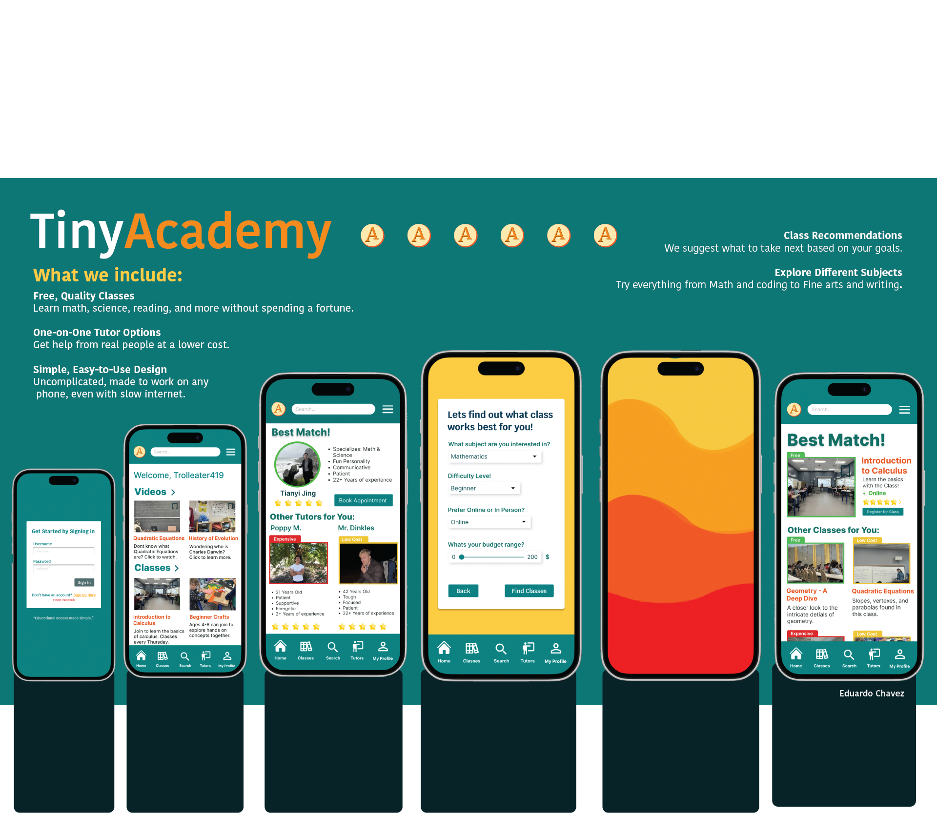
Final Product Experience
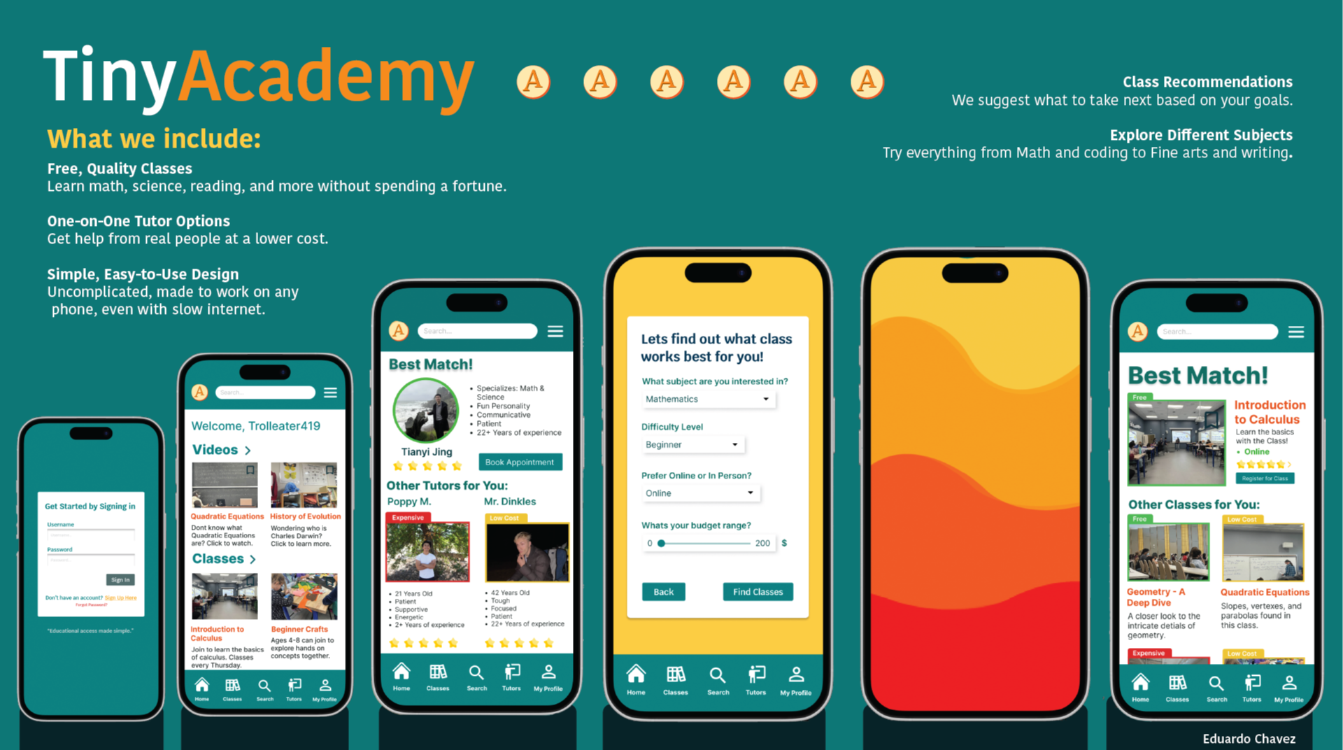
These screens represent the culmination of iterative flow design, wireframing, and refinement; prioritizing ease of navigation, clear decision-making, and approachable learning, which results in an experience that both supports quick exploration and deeper engagement.
Users can either explore classes directly or answer a short questionnaire to receive personalized class and tutor recommendations. This flow reduces friction while helping users quickly find options that match their goals, level, and budget.
Outcomes and Learning
This project demonstrated the importance of designing around real user intent rather than feature density. By focusing on guided flows and progressive disclosure, the product makes learning feel less intimidating and more actionable.
Key learnings included the value of sketching user flows early, testing assumptions through structure rather than visuals alone, and treating UX as a system of decisions rather than individual screens.
Product Evolution
The next steps would focus on securing the concept through structured usability testing and refining the recommendation logic based on real user behavior. Future iterations would explore personalization, stronger trust signals, and a tutor-facing system to support long-term scalability.